Break out your paint brushes and put on your beret, we’re continuing to reflect on the “10 Principles of Good Design” as applied to supply chain and supply chain management (Design for the Supply Chain). This week we’re going to delve into painting the supply chain… well, sort of.
Principle #4: Good design “Makes a product understandable”
“It clarifies the product’s structure. Better still, it can make the product clearly express its function by making use of the user's intuition. At best, it is self-explanatory.” – ‘Dieter Rams: ten principles for good design’
What immediately comes to mind for me when the principle talks about “making use of the user’s intuition” and being "self-explanatory” is data visualization and infographics, an area that always intrigues me. I think it’s obvious to all of us that supply chains are continuing to become more and more complex. This is due in part to the ever changing number of nodes/links in the supply chain as companies become more global. That in turn impacts processes (internal and external), interactions with suppliers and customers, focus on metrics and risk analysis, etc.
The volume of data necessary to manage these interactions from end-to-end is staggering. We generally create all kinds of reports and applications to sit on top of databases, ERP systems, and spreadsheets to capture the data. The challenge though is not so much how to capture the data but how to get our arms around it in a meaningful way. The goal is to help the supply chain professional understand the situation quicker so they can make better decisions. This is where visualization comes in. It’s said, “A picture is worth a thousand words” (original source debatable…).
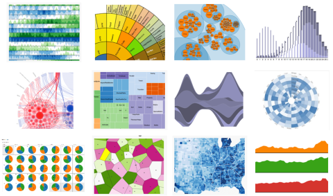
Visualizations are images that tap into our intuition by leveraging our ability to see patterns, trends, outliers, etc. This is especially true when visualizations make use of what are called ‘Preattentive Visual Properties’. “A preattentive visual property is one which is processed in spatial memory without our conscious action. In essence it takes less than 500 milliseconds for the eye and the brain to process a preattentive property of any image”. – Preattentive Visual Properties and How to Use Them in Information Visualization
So turning numbers into images that leverage our eye-brain interaction can dramatically increase the speed with which we can interpret information versus reading through rows and rows of data. We’re all familiar with visualizations such as line and bar graphs, pie charts, etc.
Fortunately, along with the growth of ‘big data’, we also have a growth in the means and methods of creating data visualizations to handle complex data. I’m often amazed at how user interface designers are able to integrate information into the tools we use for supply chain management, especially their ability to relate a lot of information understandably on mobile devices. One continuing challenge I see is integrating the ability to take action on the information presented.
Here are a couple of interesting supply chain specific data visualization articles:
- Visualizations and analytics for supply chains
- Data Visualization Helps Safeway Keep Shelves Stocked
And a couple of sites that will give you ideas and options for visualizing data as well as key principles to consider when you start painting your supply chain:
- Data Visualization Designs That Should Inspire You – 23 Infographics.
- GitHub visual index
- Tufte's Rules
In terms of Industry 4.0 it will be fascinating to see how real-time or near-real-time supply chain data will be visualized to support rapid decision making by bringing quicker, deeper understanding of complex supply chains. In addition to data provided by the immediate players in a company's supply chain network, the gathering of this live data will come from and leverage crowdsourcing and social media tools.
Let me know if you’ve come across or created any super-effective supply chain visualizations that come close to being “self-explanatory”.
Want to learn more about Design for the Supply Chain? Check out the rest of the series:
Leave a Reply